When buying furniture in Second Life, do you care about the animations?
I went to Anthem May round because I was curious about the Dust Bunny & Con Serenea Bathroom, and had my eyes set on the sauna.
That is, until I sat in it…
Well, well, well. What do we have here? A sauna with lackluster animations. I have to wonder, did the creators even bother to test them before putting them up for sale? I mean, come on. It’s not rocket science.
And don’t even get me started on the tired excuse of “creators don’t have time for quality content.” Please. When you start a business, whether it’s in real life or Second Life, you know what you’re getting into.
Just because it’s Second Life doesn’t mean we have to settle for shoddy products. I’m spending real money here, and I expect to receive a finished product that’s been made with care.
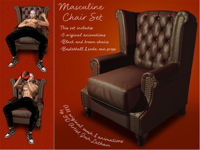
I stumbled upon the Masculine Chair Set by Adjunct and was immediately drawn to its uniqueness. I mean, who wouldn’t want a chair with original poses that don’t make you feel like you’re sitting on a park bench?
However, my enthusiasm was short-lived. It turned out to be more of a prop for photography rather than a functional chair. And to top it off, the props were not self-attached. I mean, seriously? Who wants to spend their precious SL time searching for props in their inventory?
And let’s talk about the prims. The low-quality version of the chair was a whopping 14 prims, which is just ridiculous. I mean, unless you have a ton of prims to spare, it’s not worth it to have as a permanent fixture in your home.
But let me give credit where credit is due. The creator did refund me, and I appreciate that. However, I’m still holding out hope that they will remake the chair with self-attached props because that would be grand, using less prims. And while they’re at it, a feminine version would be great too.
Let’s face it, wouldn’t it be great to have a chair with animations specific to its purpose? A kitchen stool should have animations related to cooking, while an office chair should have animations related to working at the desk. And while armchairs, sofas, and loungers are more versatile, they should still have animations that make sense.
Take Loft and & Aria furniture, for example. They have plenty of animations, but they’re organized in a way that makes it easy to choose one. Although, let’s be real, they could totally do with less of them.
Most animations with props are a hot mess. I’m not saying all creators should just give up and stick to plain vanilla animations, but come on, let’s not half-ass it with some janky props. Instead, why not team up with the pros like ChicChica and No.59, who know how to make food and drinks look mouth-wateringly realistic? It’s time for some real collaboration and ditch the subpar props.
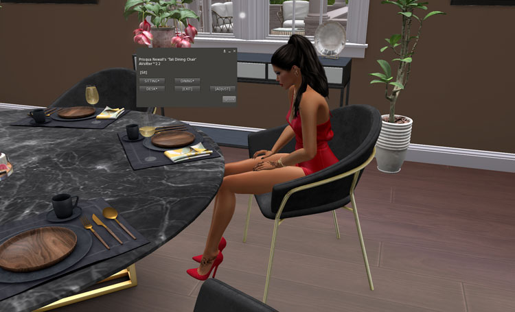
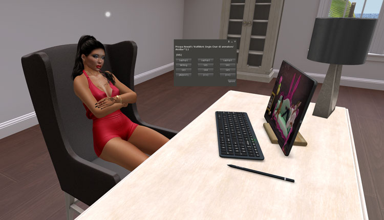
Well, well, well, look who’s back! It’s our old friend, the “too-many-animations-in-one-chair” issue. This time, it’s Kraftwork’s turn to take the heat.
I mean, seriously, 43 animations for one chair? Who has the time or the patience to go through all of that just to sit down? It’s like trying to find a needle in a haystack, except the haystack is a chair and the needle is a decent pose.
And let’s not forget the struggle of trying to remember which animation is which. Is “sit 29” the one where you look professional and productive, or the one where you look like you’re about to fall asleep?
Don’t get me wrong, I appreciate the effort that goes into creating animations, but sometimes less is more. And while we’re at it, how about giving them actual names that are related to the chair’s purpose? If it’s an office chair, name the animations things like “typing away” or “thinking hard.” It’s not rocket science.
Speaking of lack of creativity, why are we seeing so many rehashed content these days? I don’t mind a good re-texture, but how about putting in some effort to rework the animations too? It’s a small change that could make a big difference.
But hey, maybe I’m just asking too much from our beloved content creators. After all, originality seems to be a rare commodity these days.
I stumbled upon this funky sofa at the CakeDay Event. Not really my cup of tea when it comes to couches, but what caught my eye was the original animation of “cleaning your sneakers.” It may not appeal to everyone, but for those sneakerheads out there, it’s a stroke of genius.
And get this – you can even buy the animation by itself! Check out the creator’s photostream for more deets.
Speaking of animations, a couple of years ago, my sister and I went to Scarlet Creative and found some hilariously bad ones. I wrote a post about it, and to my relief, Charlotte Barlott, the creator, took it in good humor and even appreciated the feedback.
But here’s a thought: wouldn’t fewer animations mean less work for creators? I get that there are different markets to cater to, but it’s not like they have to please everyone all at once.
Some people only care about the looks of the furniture for their Flickr pics, while others just want to stand around in a pretty home. And let’s not forget the penny pinchers who only care about the price tag.
As for me, I’m all about the poses and the little details because I actually use everything in my home. But sometimes, I just like a piece for its looks and remove the animations altogether.
At the end of the day, I want to see more finished products and fewer excuses from creators in Second Life. So, where do you stand on furniture animations?


